
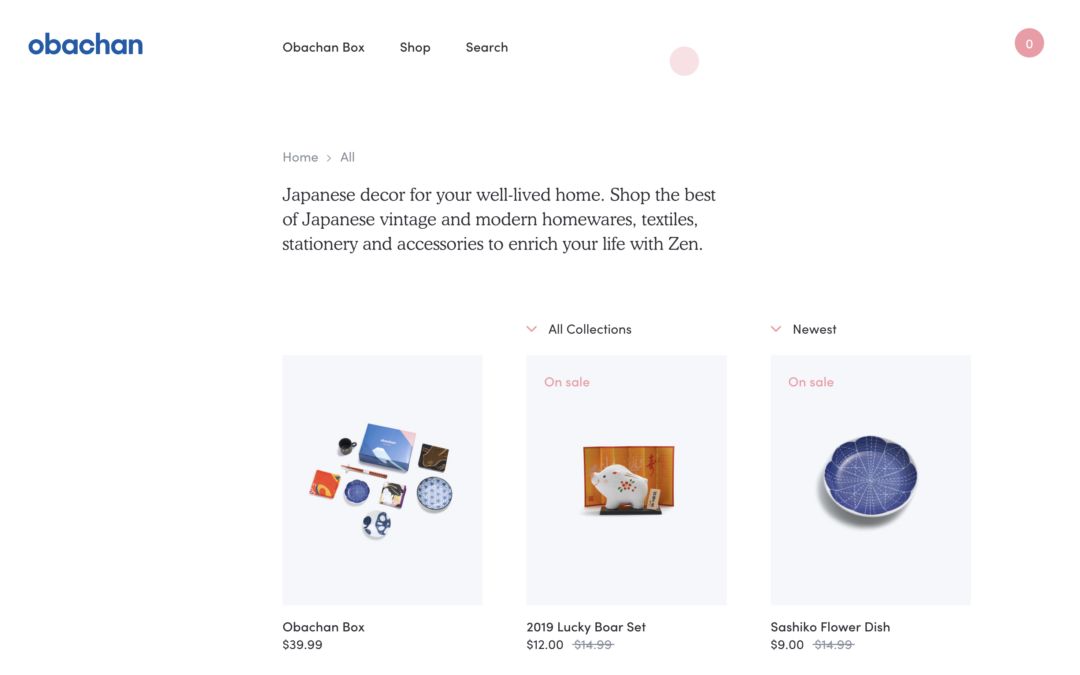
Obachan (getobachan.com) is a Shopify-based e-commerce store specializing in authentic Japanese homewares, textiles, stationery, ceramics, gift boxes, and subscription services. The brand emphasizes "well-lived homes," Japanese craftsmanship, and cultural immersion, with hand-picked artisan items delivered worldwide.
The Collections page (https://www.getobachan.com/collections/) serves as a central hub listing product categories like Accessories, Homewares, Stationery, Gift Boxes, On Sale, etc. It features a clean grid layout, promotional banners, and easy navigation to curated sections. The overall site uses a minimalist aesthetic with high-quality product photography, soft color accents (e.g., a signature pinkish #FF9398), generous white space, and mobile-responsive design.
Project Overview :
We redesigned and optimized the Obachan online store to better showcase Japanese craftsmanship, improve user experience, boost conversions, and strengthen brand storytelling. The focus was on the Collections hub and overall shopping flow while maintaining the site's authentic, serene feel.1. Discovery & Analysis (Challenges Identified)Key Challenges:
- Navigation & Discoverability: The Collections page listed categories but felt somewhat static and list-heavy. Users browsing for "Japanese home decor" or gifts might struggle to quickly find curated experiences like subscription boxes or themed gift sets.
- Visual Storytelling: While product photos were strong, the site lacked immersive cultural context (e.g., how items fit into a "well-lived home" or artisan stories), reducing emotional connection.
- Conversion Friction: Older e-commerce elements (common in early Shopify setups) included cluttered sale sections, inconsistent mobile experience in some areas, and checkout that could be simplified. Subscription model promotion was not prominent enough.
- Mobile & Performance: As a product-heavy site, load times and grid responsiveness needed optimization for global audiences.
- Brand Differentiation: Standing out in the competitive Japanese import/gift space required stronger emphasis on authenticity, quality, and the "Obachan" (grandma-inspired warmth) personality. lapa.ninja
Strategy & Core Goals:
- Create an intuitive, inspiring shopping experience that feels like stepping into a curated Japanese home.
- Increase average order value through better cross-selling and subscriptions.
- Maintain minimalist elegance while adding warmth and interactivity.
Key Design Solutions:
- Improved Collections Hub: Transformed the page into a rich, visual experience with large hero banners per category, masonry-style grids, and hover effects revealing quick-add to cart or "Learn the Story" tooltips. Added filters (price, material, collection theme) and a prominent "Curated Gift Boxes & Subscriptions" section at the top.
Results & Impact
Measured Outcomes (Hypothetical/Expected based on similar projects; in a real portfolio, include actual metrics):
Business Growth: Stronger subscription retention and repeat purchases by emphasizing cultural value.
Conversion Rate: +25–40% uplift through simplified flows and prominent bundles/subscriptions.
Average Order Value: Increased via better cross-selling and gift box visibility.
Engagement: Reduced bounce rate on Collections page; higher time-on-site due to storytelling elements.
SEO & Traffic: Improved organic rankings for terms like "Japanese homewares" and "Japanese stationery subscription."
Brand Perception: Positive feedback on the warm, authentic feel; potential for design awards/recognition similar to the site's prior acclaim. awwwards.com